Layout
The Layout class is responsible for defining the structure and layout of pages in your application. It provides a flexible and composable way to build complex user interfaces by arranging various block components.
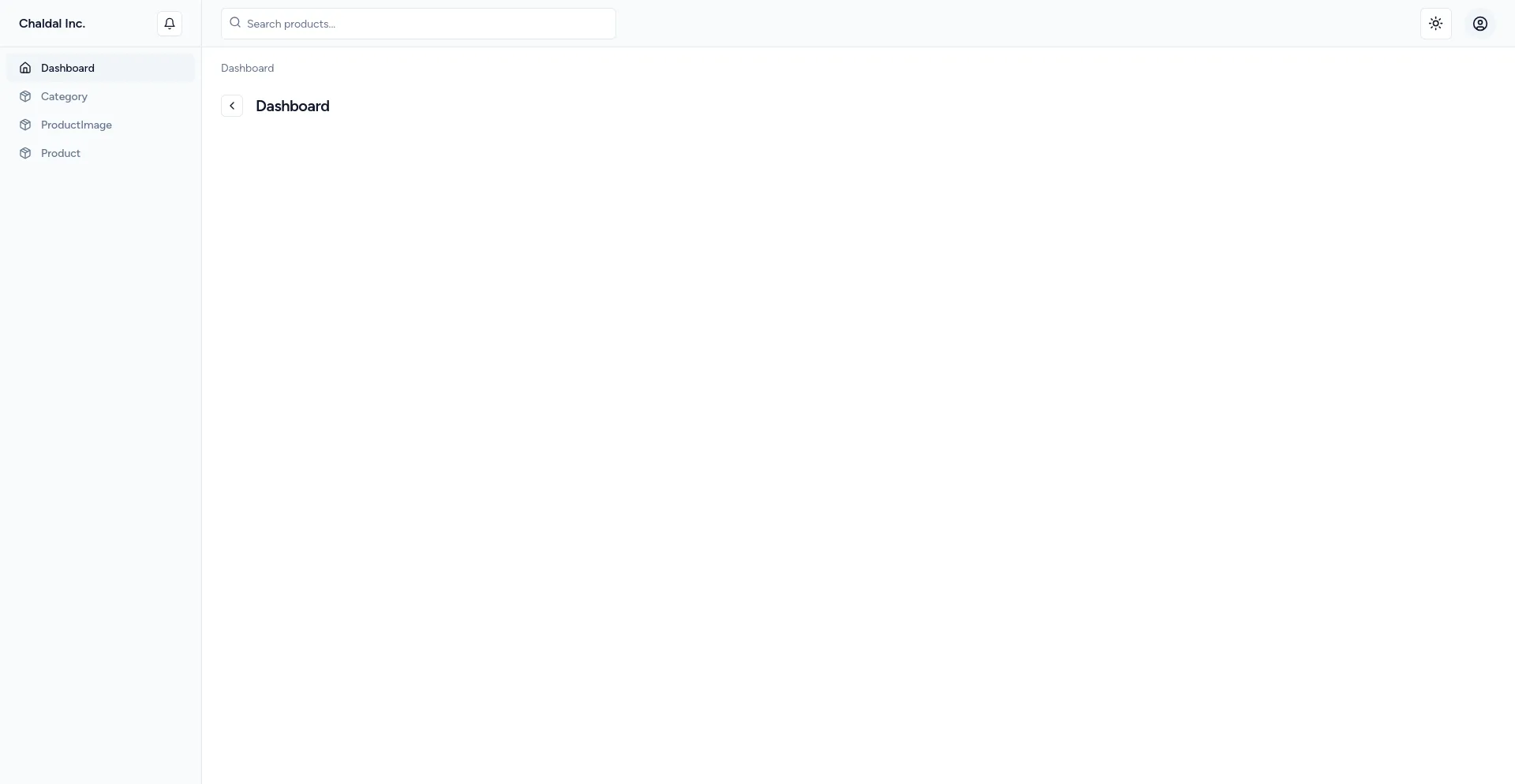
Default Layout
Xumina by default provides a default layout that looks like following with default theme

Changing Layout
All pages in a panel use the same layout and it can be set via panel layout method
public function boot(): void { $this->panel->layout(DefaultLayout::class); }Creating new layout
If you want to customize the layout then create a new layout by running the following command
php artisan xumina:layoutCustomizing layout
The outline method is where you define the structure of your layout. It should return an array of block component definitions:
public function outline(): array{ return [ Container::make() ->class('grid gap-4') ->items([ SideBar::make(), TopBar::make(), Content::make(), ]) ];}Using block components
Xumina provides several built-in block components for common layout elements:
- Container: A wrapper component for grouping other components.
- SideBar: For creating a sidebar navigation.
- TopBar: For creating a top navigation bar.
- Content: For defining the main content area.
- Breadcrumb: For adding breadcrumb navigation.
- PageHeader: For adding a page title and actions to your page.
- PageFooter: Area for adding any footer content.
Visit the comoponent pages to learn more about them.